
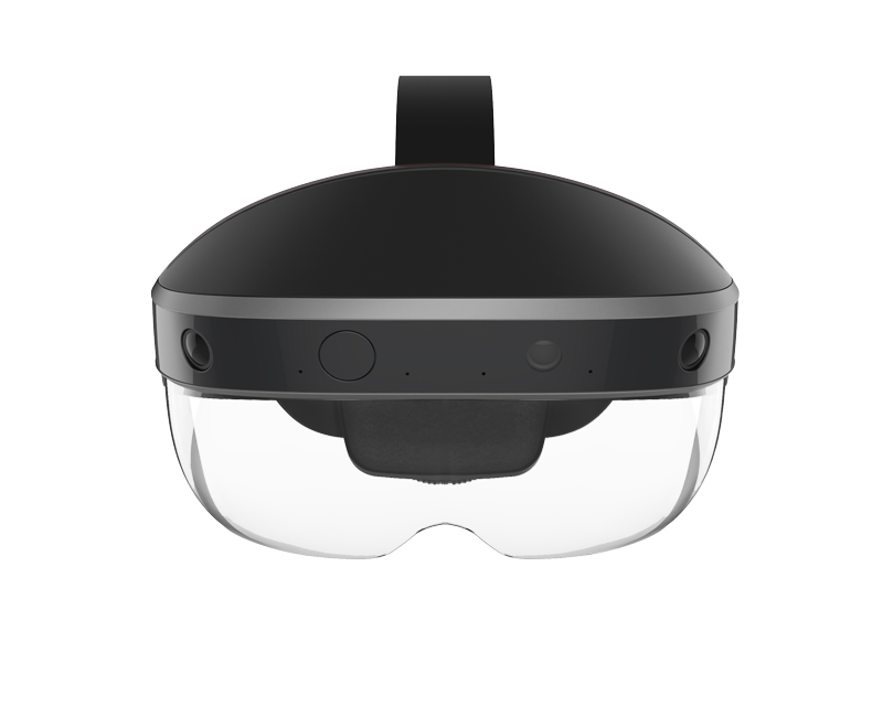
EXISTING INTERACTION PARADIGMS ARE LIMITING. LET'S IMAGINE AND DEFINE A MORE NATURAL INTERACTION MODEL FOR augmented reality AND CARRY THAT TO ALL TOUCHPOINTS.
SITUATION
The initial engagement was traditional enough. An ex colleague brought me in to take a look at their website, take stock and craft a new web experience in anticipation of a product launch.
That initial engagement quickly evolved in both scope and role and today I serve a hybrid role between UX and product, working closely with the VP of Creative and Chief Product Officer. Projects included the design of Meta's next generation AR interface & interaction model, defining the software ecosystem that accompanies the Meta headset as well as defining in close collaboration with product the onboarding e
IMPACT
Ongoing.
AREAS
- Product Strategy
- Product Design
- UI Design
- Information Architecture
- Interaction Design
- Research
- Competitive Analysis
- Sketching
- Prototyping
“His insights and thoughtfulness made us bring him into more and more projects, to the point that he was at the very center of most of our critical customer-facing projects”
CLIENTS & COLLABORATORS
Here are some of the companies, brands and startups I've worked for or had as clients


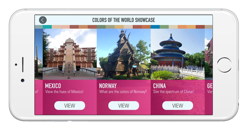
WITH A NEW EXHIBIT BEING BUILT IN DISNEYWORLD, THE CLIENT ASK WAS FOR A one-of-a-kind exhibit companion app THAT INTEGRATED THE EXHIBIT AND LIVE GAMING.

SITUATION
The initial brief from Disney Parks was clear and thorough. The ask was for a exhibit companion app, that would be sticky both at the park and when the family had return from their vacation.
To keep users busy at the park, a geolocated hunt was created, allowing users to unlock exclusive colors as they walked around Disneyworld features. But the real world interaction didn't stop there, at the Colortopia examples users were able to play two games that were reacted in real time with the exhibit.
Once home, app users, could use the app to take a picture of a room and apply their favorite colors or one they had discovered on their visit to Disneyworld unto any wall in their home.
IMPACT
A critically well received app that more than 2 years after its initial launch, still garners more than four stars on the Apple Store.
AREAS
- Creative Strategy
- UI Design
- Mobile Design
- Game Design
- Information Architecture

FOX BROADCASTING ASKED US TO UPDATE THEIR FULL EPISODE PAGE AND GLOBAL VIDEO PLAYER JUST IN TIME FOR A NEW SEASON.

SITUATION
After assessing the current digital offering, the Product department and I put forward experiences principles to guide our design and strategic decisions. they were:
TRUTH #1: NOT EVERYONE IS A FAN. Don't Assume everyone is a Fox addict. Don't assume they know your entire lineup. Provide context and differentiation by surfacing information like genres. Show consumers the entire lineup don't make it hard to discover.
TRUTH #2: FOCUS. Sometimes big entities get stuck in trying to appease department heads instead of catering to consumers. In the case of Fox, the show was the the star. Make it easy to catch up, to learn more, to get to know the cast and related content to allow consumers to become fans.
TRUTH #3: NO DEAD ENDS. Don't stop giving viewers and fans what they like. When one episode ends, automatically go to the next piece of content. Don't require users intervention to continue and stream your content. In other words let them binge.
IMPACT
Our combined recommendation of reducing the number of ads combined with enabling binge watching increased ad revenues.
AREAS
- Product Strategy
- Product Design
- UI Design
- Information Architecture
“Sean was fantastic to work with. Strong, highly motivated and forward thinking team player.”

VITASIGN ASKED US TO HElp them move beyond their basic health reporting app and create a completely new experience and look and feel.


SITUATION
Before any pixels were sacrificed or boxes drawn, we started with getting an understanding of who their current users were, how often they used the app and how many connected devices they had registered.
Once we knew who the audience was and their current habits, we tool to paper and pen to sketch out new experience concepts.
Once a direction was selected and tested, we took the task of evolving the brand, collaborating with a talented designer to come up with a new language for health.
IMPACT
Help the client create a new visual language for health
AREAS
- Creative Strategy
- Product Strategy
- UI Design
- Mobile Design
- Information Architecture
- Branding & Design